Introduction
In this page I am going to take you thru a project that creates a Dashboard for selected countries and indicators. The dashboard feeds from the World Bank API, it makes a request in python, then loads the data to a pandas data frame. After that we use vizualization libraries to show plot the data and create the dashboard.
How the API Works?
The API works in a simple way. We need: The country code, the dates, the format we want the response, and the indicator ID.
To get the indicator ID's we are going to visit the following website: https://data.worldbank.org/indicator?tab=all In here we will go ahead and click on the indicator from which we want to get the data. The in the url we would find the ID after the following characters ...indicator/"indicator ID".
As an example if we open the first indicator named Access to electricity, rural (% of rural population) , in the url we can find that the ID is EG.ELC.ACCS.RU.ZS
Url: https://data.worldbank.org/indicator/EG.ELC.ACCS.RU.ZS?view=chart
Create a Indicator ID Dictionary
indicators_WolrdBank = {
"Population growth (annual %)" : "SP.POP.GROW",
"Foreign direct investment, net inflows (BoP, current US$)" : "BX.KLT.DINV.CD.WD",
"Renewable energy consumption (% of total final energy consumption)" : "EG.FEC.RNEW.ZS",
"Individuals using the Internet (% of population)" : "IT.NET.USER.ZS",
"Access to electricity (% of population)" : "EG.ELC.ACCS.ZS",
"Military expenditure (% of GDP)" : "MS.MIL.XPND.GD.ZS",
"GDP (current US$)" : "NY.GDP.MKTP.CD",
"GDP per capita (current US$)" : "NY.GDP.PCAP.CD",
"Inflation, consumer prices (annual %)" : "FP.CPI.TOTL.ZG",
"Unemployment, total (% of total labor force) (modeled ILO estimate)" : "SL.UEM.TOTL.ZS"
}
Create the data extraction logic
We now code the logic in order to extract the data. We first declare the variables needed such as the url to make the request and the parameters that we would like, then we iterate over each indicator in the dictionary and at the same time we iterate over the countries list.
Finally we get a data frame that has all the data.
import requests
import pandas as pd

# World Bank API base URL
base_url = "http://api.worldbank.org/v2/country/{}/indicator/{}"

# USA = United States , CRI = Costa Rica , DE = Germany , CH = Switzerland

# Countries and indicators
countries = ["USA", "CRI","DE","CH"]
# Parameters for API requests
params = {
    "format": "json",
    "date": "2010:2023"
}

# Initialize an empty list to store the data
data_list = []

# Fetch data for each country and each indicator
for indicator_name, indicator_code in indicators_WorldBank.items():
    for country in countries:
        response = requests.get(base_url.format(country, indicator_code), params=params)

        # Check if the request is successful
        if response.status_code == 200:
            data = response.json()

            # Ensure data is valid and process the response
            if len(data) > 1 and data[1] is not None:
                for entry in data[1]:
                    if entry["value"] is not None:  # Ensure there's a valid value
                        data_list.append({
                            "Date": entry["date"],
                            "Country": country,
                            "Indicator": indicator_name,
                            "Value": entry["value"]
                        })
        else:
            print(f"Failed to fetch data for {indicator_name} ({country})")

# Convert the list of data into a DataFrame
df_raw = pd.DataFrame(data_list)

# Display the DataFrame
print(df)
     Date Country                                          Indicator     Value
0    2023     USA                       Population growth (annual %)  0.491925
1    2022     USA                       Population growth (annual %)  0.367473
2    2021     USA                       Population growth (annual %)  0.157343
3    2020     USA                       Population growth (annual %)  0.969000
4    2019     USA                       Population growth (annual %)  0.455381
..    ...     ...                                                ...       ...
253  2014     CRI  Unemployment, total (% of total labor force) (...  8.499000
254  2013     CRI  Unemployment, total (% of total labor force) (...  8.218000
255  2012     CRI  Unemployment, total (% of total labor force) (...  9.110000
256  2011     CRI  Unemployment, total (% of total labor force) (...  9.518000
257  2010     CRI  Unemployment, total (% of total labor force) (...  7.171000

[258 rows x 4 columns]
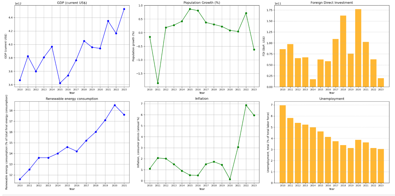
Ploting the data
After checking that we have all the data needed in the df called df_raw, we now plot each of the metrics.
For this we create separate dataframes and we populate them with the specific data for each indicator by filtering the respective data frames, we are going to use for this execrise only line and bar graphs.
In order to make this an "interactive" dashboard, we are going to set the parameter country_filter at the begining of the script so that we only need to change this value and we can show the data for that specific country.
import matplotlib.pyplot as plt

country_filter = "DE"

# Create a single figure with 2 rows and 3 columns (for 5 subplots)
fig, axes = plt.subplots(2, 3, figsize=(20, 10))  # 2 rows, 3 columns

# Flatten axes for easier indexing
axes = axes.flatten()

#____________________________________________
# Graph1: GDP (current US$)
indicator_filter = "GDP (current US$)"
gdp_df = df_raw[(df_raw["Country"] == country_filter) & (df_raw["Indicator"] == indicator_filter)]
gdp_df = gdp_df.sort_values(by="Date")

axes[0].plot(gdp_df["Date"], gdp_df["Value"], marker='o', linestyle='-', color='blue')
axes[0].set_xlabel("Year")
axes[0].set_ylabel("GDP (current US$)")
axes[0].set_title("GDP (current US$)")
axes[0].grid(True)
axes[0].tick_params(axis='x', labelsize=8)  # Set x-axis label size smaller

#____________________________________________
# Graph2: Population growth (annual %)
indicator_filter = "Population growth (annual %)"
population_df = df_raw[(df_raw["Country"] == country_filter) & (df_raw["Indicator"] == indicator_filter)]
population_df = population_df.sort_values(by="Date")

axes[1].plot(population_df["Date"], population_df["Value"], marker='o', linestyle='-', color='green')
axes[1].set_xlabel("Year")
axes[1].set_ylabel("Population growth (%)")
axes[1].set_title("Population Growth (%)")
axes[1].grid(True)
axes[1].tick_params(axis='x', labelsize=8)  # Set x-axis label size smaller

#____________________________________________
# Graph3: Foreign direct investment, net inflows (BoP, current US$)
indicator_filter = "Foreign direct investment, net inflows (BoP, current US$)"
finvest_df = df_raw[(df_raw["Country"] == country_filter) & (df_raw["Indicator"] == indicator_filter)]
finvest_df = finvest_df.sort_values(by="Date")

axes[2].bar(finvest_df["Date"], finvest_df["Value"], color='orange', alpha=0.8)
axes[2].set_xlabel("Year")
axes[2].set_ylabel("FDI (BoP, US$)")
axes[2].set_title("Foreign Direct Investment")
axes[2].grid(axis='y', linestyle='--', alpha=0.7)
axes[2].tick_params(axis='x', labelsize=8)  # Set x-axis label size smaller

#____________________________________________


# Graph4: Renewable energy consumption (% of total final energy consumption)
indicator_filter = "Renewable energy consumption (% of total final energy consumption)"
renewable_df = df_raw[(df_raw["Country"] == country_filter) & (df_raw["Indicator"] == indicator_filter)]
renewable_df = renewable_df.sort_values(by="Date")

axes[3].plot(renewable_df["Date"], renewable_df["Value"], marker='o', linestyle='-', color='blue')
axes[3].set_xlabel("Year")
axes[3].set_ylabel("Renewable energy consumption (% of total final energy consumption)")
axes[3].set_title("Renewable energy consumption")
axes[3].grid(True)
axes[3].tick_params(axis='x', labelsize=8)  # Set x-axis label size smaller

#____________________________________________
# Graph5: Inflation, consumer prices (annual %)
indicator_filter = "Inflation, consumer prices (annual %)"
inflation_df = df_raw[(df_raw["Country"] == country_filter) & (df_raw["Indicator"] == indicator_filter)]
inflation_df = inflation_df.sort_values(by="Date")

axes[4].plot(inflation_df["Date"], inflation_df["Value"], marker='o', linestyle='-', color='green')
axes[4].set_xlabel("Year")
axes[4].set_ylabel("Inflation, consumer prices (annual %)")
axes[4].set_title("Inflation")
axes[4].grid(True)
axes[4].tick_params(axis='x', labelsize=8)  # Set x-axis label size smaller

#____________________________________________
# Graph6: Unemployment, total (% of total labor force) (modeled ILO estimate)
indicator_filter = "Unemployment, total (% of total labor force) (modeled ILO estimate)"
unemployment_df = df_raw[(df_raw["Country"] == country_filter) & (df_raw["Indicator"] == indicator_filter)]
unemployment_df = unemployment_df.sort_values(by="Date")

axes[5].bar(unemployment_df["Date"], unemployment_df["Value"], color='orange', alpha=0.8)
axes[5].set_xlabel("Year")
axes[5].set_ylabel("Unemployment, total (% of total labor force)")
axes[5].set_title("Unemployment")
axes[5].grid(axis='y', linestyle='--', alpha=0.7)
axes[5].tick_params(axis='x', labelsize=8)  # Set x-axis label size smaller

# Adjust layout for proper spacing
plt.tight_layout()

# Show the combined plot
plt.show()
